
Discover how Coaching Actuaries rebuilt our platform to meet WCAG accessibility standards, from five new color canvases to meaningful alt text for 17,000 instructional images.
You might have noticed the Coaching Actuaries platform looking a little different lately: updated buttons, colors, layouts, and interactions across the site. These changes are part of the most significant accessibility overhaul our team has ever undertaken.
Since December 2025, we have worked to bring our platform more fully in line with modern digital accessibility standards. This effort allows Coaching Actuaries to better support every learner.
Building a More Accessible Platform
Accessibility has been part of our product work for a long time. Over the past few years, we've made meaningful progress toward a cleaner, more consistent Coaching Actuaries experience. The recent Americans with Disabilities Act (ADA) requirements for digital services gave that ongoing work a clearer standard to meet and a reason to move faster.
Together, these ADA updates make Coaching Actuaries easier to navigate and more reliable for everyone.
The ADA prohibits discrimination against people with disabilities. Many people associate the ADA with physical spaces, but its protections now extend to digital products as well.
For websites and software, the standard is the Web Content Accessibility Guidelines (WCAG), which define how digital experiences can better support students with different needs. That includes features such as readable color contrast, keyboard navigation, screen reader support, clear page structure, form labels, and helpful error messages.
On their own, these updates might seem small. Together, they make Coaching Actuaries easier to navigate and more reliable for everyone.
What These Updates Mean for You
These updates have required significant work planning, designing, redesigning, and building. Because our platform is interconnected, every change ripples outward into the tools students use every day, both inside and outside the classroom. Here are just a few of the updates we've made.
A new color system
Not everyone can study in ideal conditions, and not everyone sees color the same way. Working in a bright room with sunlight hitting your screen, studying outdoors, or using a monitor with a lower-quality display can all blur the lines between whites and grays, making low-contrast content difficult to read.
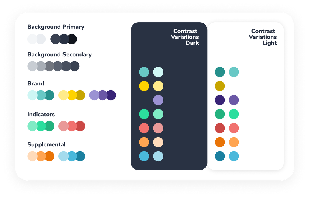
That's why we built a new system of five defined color environments, or canvases, ranging from a clean neutral baseline to an inverted option for dark backgrounds.
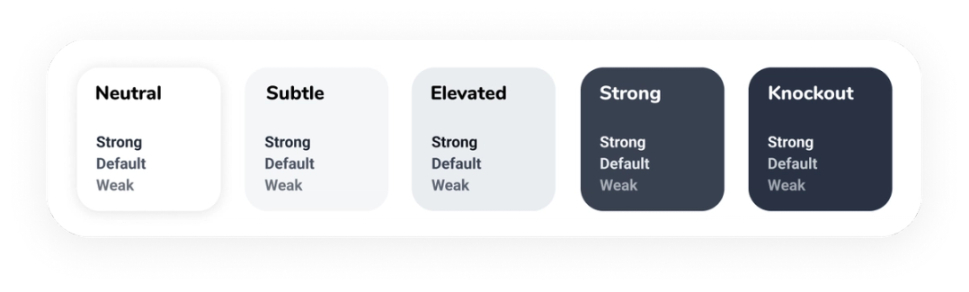
Every button, card, label, and data visualization on the platform now lives within this system. When you open a practice problem at 11:39 p.m. in a dim room, readable contrast is already there. (But we hope you can go to sleep soon.)
Performance feedback that goes beyond color
Throughout our Learn and Practice tools, results were previously communicated primarily through color: green means you're doing well, red means you're struggling. That's intuitive for most users but leaves out students with color vision deficiencies.
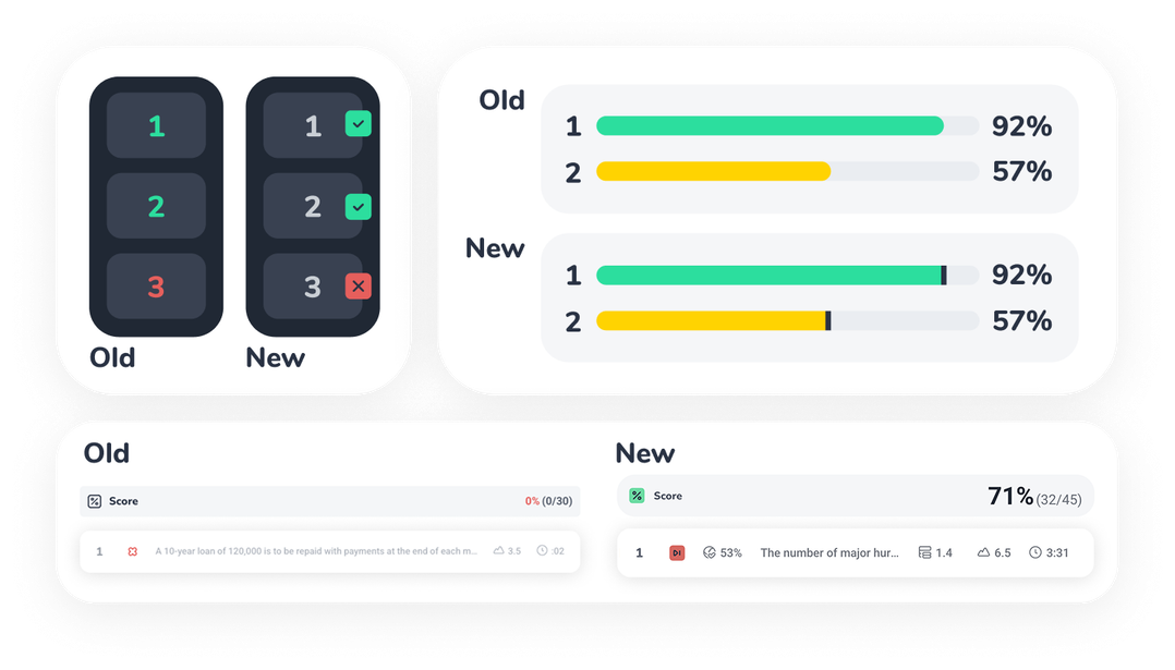
A meaningful number of people (1 in 12 men, 1 in 200 women) have some form of color vision deficiency, meaning some of our students have been getting incomplete feedback. The updated design uses color, icons, and text labels together, so every piece of information comes through in more than one way.
Now, every student gets the full picture. Plus, the added iconography and labeling make the feedback clearer for everyone.
Rebuilt structure and alt text for screen readers
Screen readers experience a page differently than sighted users do. They rely on the structure beneath the visual interface: headings, landmarks, labels, buttons, form fields, and image descriptions that explain what's on the page and how everything fits together.
For Coaching Actuaries, that includes meaningful alt text for roughly 17,000 instructional images across the platform. These images often carry real teaching value, from probability diagrams to cash flow tables, so each description needs to be accurate, useful, and specific to what a student is studying.
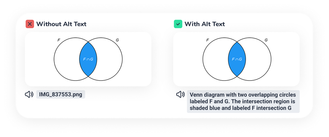
To support this experience, we also created a new accessibility toolkit that brings our brand system and accessibility standards together. The goal is to give students using screen readers a coherent, navigable experience with no guessing or workarounds required.
A design system that carries forward
This work shapes everything we build going forward. We standardized our components and design patterns so that accessibility is integrated from the start. When issues arise, we can identify and fix them faster because the underlying system is consistent.
This updated design system extends beyond the platform itself to every other place where Coaching Actuaries shows up.
And because our system is built to scale, it extends beyond the platform itself, to social media, marketing, and every other place where Coaching Actuaries shows up. Even our Instagram posts!
Accessibility Is an Ongoing Project
Every part of the platform has been reviewed and updated: Learn, Practice, inClass, exams, self-grading, and platform communications.
And the work continues. Standards will evolve, the platform will grow, and there will always be more to do. As we test and refine, you might notice small adjustments after things go live. We wanted to let you know in advance, so you'd understand the work that's underway.
Every student using Coaching Actuaries deserves tools that actually work for them, including those who use assistive technology. That's what this work is about, and it's what we'll keep building toward.